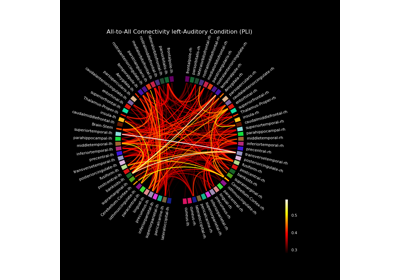
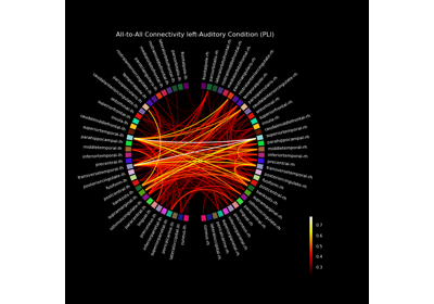
mne_connectivity.viz.plot_connectivity_circle#
- mne_connectivity.viz.plot_connectivity_circle(con, node_names, indices=None, n_lines=None, node_angles=None, node_width=None, node_height=1.0, node_colors=None, facecolor='black', textcolor='white', node_edgecolor='black', linewidth=1.5, colormap='hot', vmin=None, vmax=None, colorbar=True, title=None, colorbar_size=0.2, colorbar_pos=(-0.3, 0.1), fontsize_title=12, fontsize_names=8, fontsize_colorbar=8, padding=6.0, ax=None, fig=None, subplot=None, interactive=True, node_linewidth=2.0, show=True)[source]#
Visualize connectivity as a circular graph.
- Parameters
con :
array|ConnectivityConnectivity scores. Can be a square matrix, or a 1D array. If a 1D array is provided, “indices” has to be used to define the connection indices.
Node names. The order corresponds to the order in con.
indices :
tupleofarray|NoneTwo arrays with indices of connections for which the connections strengths are defined in con. Only needed if con is a 1D array.
If not None, only the n_lines strongest connections (strength=abs(con)) are drawn.
node_angles :
array, shape (n_node_names,) |NoneArray with node positions in degrees. If None, the nodes are equally spaced on the circle. See mne.viz.circular_layout.
Width of each node in degrees. If None, the minimum angle between any two nodes is used as the width.
node_height :
floatThe relative height of the colored bar labeling each node. Default 1.0 is the standard height.
node_colors :
listoftuple|listofstrList with the color to use for each node. If fewer colors than nodes are provided, the colors will be repeated. Any color supported by matplotlib can be used, e.g., RGBA tuples, named colors.
facecolor :
strColor to use for background. See matplotlib.colors.
textcolor :
strColor to use for text. See matplotlib.colors.
node_edgecolor :
strColor to use for lines around nodes. See matplotlib.colors.
linewidth :
floatLine width to use for connections.
colormap :
str| instance ofmatplotlib.colors.LinearSegmentedColormapColormap to use for coloring the connections.
Minimum value for colormap. If None, it is determined automatically.
Maximum value for colormap. If None, it is determined automatically.
colorbar : bool
Display a colorbar or not.
title :
strThe figure title.
colorbar_size :
floatSize of the colorbar.
colorbar_pos :
tuple, shape (2,)Position of the colorbar.
fontsize_title :
intFont size to use for title.
fontsize_names :
intFont size to use for node names.
fontsize_colorbar :
intFont size to use for colorbar.
padding :
floatSpace to add around figure to accommodate long labels.
ax : instance of matplotlib
PolarAxes|NoneThe axes to use to plot the connectivity circle.
fig :
None| instance ofmatplotlib.figure.FigureThe figure to use. If None, a new figure with the specified background color will be created.
Deprecated: will be removed in version 0.5.
subplot :
int|tuple, shape (3,)Location of the subplot when creating figures with multiple plots. E.g. 121 or (1, 2, 1) for 1 row, 2 columns, plot 1. See matplotlib.pyplot.subplot.
Deprecated: will be removed in version 0.5.
interactive : bool
When enabled, left-click on a node to show only connections to that node. Right-click shows all connections.
node_linewidth :
floatLine with for nodes.
show : bool
Show figure if True.
- Returns
fig : instance of
matplotlib.figure.FigureThe figure handle.
ax : instance of
matplotlib.projections.polar.PolarAxesThe subplot handle.
Notes
This code is based on a circle graph example by Nicolas P. Rougier
By default,
matplotlib.pyplot.savefig()does not takefacecolorinto account when saving, even if set when a figure is generated. This can be addressed via, e.g.:>>> fig.savefig(fname_fig, facecolor='black')
If
facecoloris not set viamatplotlib.pyplot.savefig(), the figure labels, title, and legend may be cut off in the output figure.