mne.viz.plot_arrowmap
- mne.viz.plot_arrowmap(data, info_from, info_to=None, scale=3e-10, vmin=None, vmax=None, cmap=None, sensors=True, res=64, axes=None, names=None, show_names=False, mask=None, mask_params=None, outlines='head', contours=6, image_interp='bilinear', show=True, onselect=None, extrapolate='auto', sphere=None)[source]
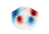
Plot arrow map.
Compute arrowmaps, based upon the Hosaka-Cohen transformation 1, these arrows represents an estimation of the current flow underneath the MEG sensors. They are a poor man’s MNE.
Since planar gradiometers takes gradients along latitude and longitude, they need to be projected to the flattened manifold span by magnetometer or radial gradiometers before taking the gradients in the 2D Cartesian coordinate system for visualization on the 2D topoplot. You can use the
info_fromandinfo_toparameters to interpolate from gradiometer data to magnetometer data.- Parameters
- data
array, shape (n_channels,) The data values to plot.
- info_frominstance of
Info The measurement info from data to interpolate from.
- info_toinstance of
Info|None The measurement info to interpolate to. If None, it is assumed to be the same as info_from.
- scale
float, default 3e-10 To scale the arrows.
- vmin
float|callable()|None The value specifying the lower bound of the color range. If None, and vmax is None, -vmax is used. Else np.min(data). If callable, the output equals vmin(data). Defaults to None.
- vmax
float|callable()|None The value specifying the upper bound of the color range. If None, the maximum absolute value is used. If callable, the output equals vmax(data). Defaults to None.
- cmapmatplotlib colormap |
None Colormap to use. If None, ‘Reds’ is used for all positive data, otherwise defaults to ‘RdBu_r’.
- sensorsbool |
str Add markers for sensor locations to the plot. Accepts matplotlib plot format string (e.g., ‘r+’ for red plusses). If True (default), circles will be used.
- res
int The resolution of the topomap image (n pixels along each side).
- axesinstance of
Axes|None The axes to plot to. If None, a new figure will be created.
- names
list|None List of channel names. If None, channel names are not plotted.
- show_namesbool |
callable() If True, show channel names on top of the map. If a callable is passed, channel names will be formatted using the callable; e.g., to delete the prefix ‘MEG ‘ from all channel names, pass the function
lambda x: x.replace('MEG ', ''). Ifmaskis not None, only significant sensors will be shown. IfTrue, a list of names must be provided (seenameskeyword).- mask
ndarrayof bool, shape (n_channels,) |None Array indicating channel(s) to highlight with a distinct plotting style. Array elements set to
Truewill be plotted with the parameters given inmask_params. Defaults toNone, equivalent to an array of allFalseelements.- mask_params
dict|None Additional plotting parameters for plotting significant sensors. Default (None) equals:
dict(marker='o', markerfacecolor='w', markeredgecolor='k',
        linewidth=0, markersize=4)
- outlines‘head’ | ‘skirt’ |
dict|None The outlines to be drawn. If ‘head’, the default head scheme will be drawn. If ‘skirt’ the head scheme will be drawn, but sensors are allowed to be plotted outside of the head circle. If dict, each key refers to a tuple of x and y positions, the values in ‘mask_pos’ will serve as image mask. Alternatively, a matplotlib patch object can be passed for advanced masking options, either directly or as a function that returns patches (required for multi-axis plots). If None, nothing will be drawn. Defaults to ‘head’.
- contours
int|arrayoffloat The number of contour lines to draw. If 0, no contours will be drawn. If an array, the values represent the levels for the contours. The values are in µV for EEG, fT for magnetometers and fT/m for gradiometers. Defaults to 6.
- image_interp
str The image interpolation to be used. All matplotlib options are accepted.
- showbool
Show figure if True.
- onselect
callable()|None Handle for a function that is called when the user selects a set of channels by rectangle selection (matplotlib
RectangleSelector). If None interactive selection is disabled. Defaults to None.- extrapolate
str Options:
'box'Extrapolate to four points placed to form a square encompassing all data points, where each side of the square is three times the range of the data in the respective dimension.
'local'(default)Extrapolate only to nearby points (approximately to points closer than median inter-electrode distance). This will also set the mask to be polygonal based on the convex hull of the sensors.
'head'Extrapolate out to the edges of the clipping circle. This will be on the head circle when the sensors are contained within the head circle, but it can extend beyond the head when sensors are plotted outside the head circle.
Changed in version 0.21:
The default was changed to
'local''local'was changed to use a convex hull mask'head'was changed to extrapolate out to the clipping circle.
New in version 0.18.
- sphere
float| array_like |str|None The sphere parameters to use for the cartoon head. Can be array-like of shape (4,) to give the X/Y/Z origin and radius in meters, or a single float to give the radius (origin assumed 0, 0, 0). Can also be a spherical ConductorModel, which will use the origin and radius. Can be “auto” to use a digitization-based fit. Can also be None (default) to use ‘auto’ when enough extra digitization points are available, and 0.095 otherwise. Currently the head radius does not affect plotting.
New in version 0.20.
- data
- Returns
- fig
matplotlib.figure.Figure The Figure of the plot.
- fig
Notes
New in version 0.17.
References
- 1
David Cohen and Hidehiro Hosaka. Part II magnetic field produced by a current dipole. Journal of Electrocardiology, 9(4):409–417, 1976. doi:10.1016/S0022-0736(76)80041-6.