Note
Go to the end to download the full example code. or to run this example in your browser via Binder
Signal Quality Evaluation#
This tutorial demonstrates how signal quality can be evaluated using MNE-NIRS.
Ensuring your data is of high quality is essential to good scientific research. Evaluating data quality is an essential part of both data collection and analysis. For assessing data quality during data acquisition tools such as PHOEBE are highly recommended, these allow the researcher to address potential problems immediately and modify their experiment to improve the quality of recorded data. It is also important to assess data quality during data analysis. MNE-Python and MNE-NIRS provides several mechanisms to allow researchers to evaluate the quality of their data and to include this information in their downstream processing. Dedicated tools exist for quality evaluatiuon such as Montero Hernandez (2020). This tutorial demonstrates methods in MNE-NIRS and MNE-Python for determining channels with poor signal quality, and methods for determining time segments of data that are of low quality in a subset of channels.
Two methods are introduced in this tutorial. The scalp coupling index (SCI) and peak power (PP) metrics. Both of these methods examine the signal for the presence of a heart beat signal, which indicates that the sensors were in contact with the scalp. For further details see the papers listed in the relevant literature sidebar.
# sphinx_gallery_thumbnail_number = 7

# Authors: Robert Luke <mail@robertluke.net>
#
# License: BSD (3-clause)

import os
from itertools import compress

import matplotlib.pyplot as plt
import mne
import numpy as np
from mne.preprocessing.nirs import optical_density

from mne_nirs.preprocessing import peak_power, scalp_coupling_index_windowed
from mne_nirs.visualisation import plot_timechannel_quality_metric
Import data#
Here we will work with the fNIRS motor data. We resample the data to make indexing exact times more convenient. We then convert the data to optical density and plot the raw signal.
fnirs_data_folder = mne.datasets.fnirs_motor.data_path()
fnirs_cw_amplitude_dir = os.path.join(fnirs_data_folder, "Participant-1")
raw_intensity = mne.io.read_raw_nirx(fnirs_cw_amplitude_dir, verbose=True)
raw_intensity.load_data().resample(4.0, npad="auto")
raw_od = optical_density(raw_intensity)
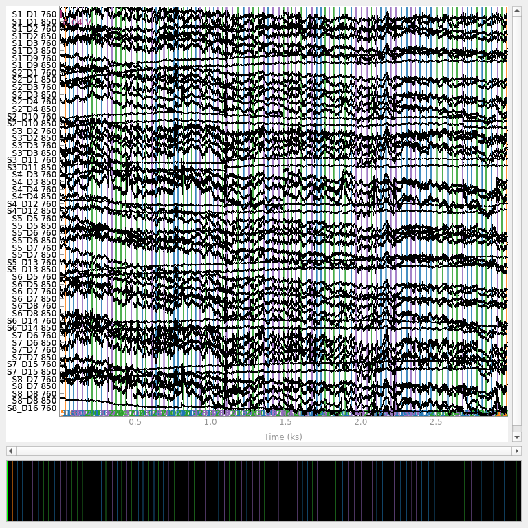
raw_od.plot(n_channels=55, duration=4000, show_scrollbars=False, clipping=None)
Loading /home/circleci/mne_data/MNE-fNIRS-motor-data/Participant-1

<mne_qt_browser._pg_figure.MNEQtBrowser object at 0x7fdb27e51fc0>
From the above plot we observe that the data is relatively clean. Later we will add some artificial bad sections to demonstrate the quality evaluation metrics.
Scalp Coupling Index#
The scalp coupling index (SCI) from Pollonini (2016) provides a measure of the quality of the signal for a channel over a specified measurement duration. See Pollonini (2016) for further details of the theory and implementation.
SCI evaluated over entire signal#
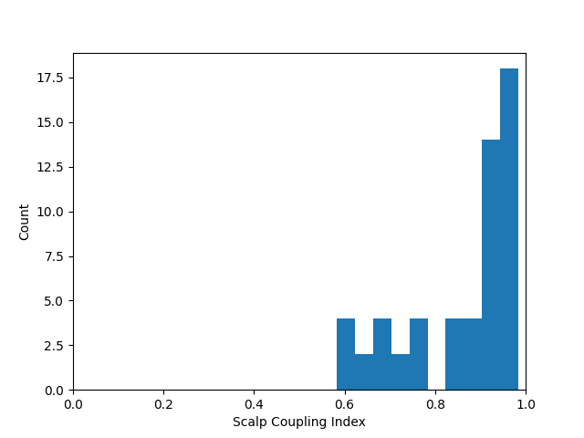
Here we calculate the SCI for each channel over the entire signal and view the distribution of values.
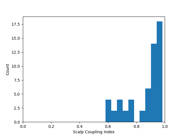
sci = mne.preprocessing.nirs.scalp_coupling_index(raw_od)
fig, ax = plt.subplots()
ax.hist(sci)
ax.set(xlabel="Scalp Coupling Index", ylabel="Count", xlim=[0, 1])
[Text(0.5, 23.52222222222222, 'Scalp Coupling Index'), Text(33.972222222222214, 0.5, 'Count'), (0.0, 1.0)]
We observe that most of the channels have a good SCI of 1, but a few channels have a poorer score. We can list the channels with an SCI below a threshold. And we can mark these as bad in the MNE data. This way the functions downstream will know that the data in these channels is bad. For this example we set the threshold for a bad channel to be SCI < 0.8. We then print a list of the bad channels and observe their are 10 channels (five source-detector pairs) that are marked as bad.
raw_od.info["bads"] = list(compress(raw_od.ch_names, sci < 0.7))
print(raw_od.info["bads"])
['S1_D1 760', 'S1_D1 850', 'S1_D9 760', 'S1_D9 850', 'S3_D2 760', 'S3_D2 850', 'S5_D5 760', 'S5_D5 850', 'S5_D7 760', 'S5_D7 850']
We can plot the time course of the signal again and note that the bad channels are now displayed in grey to indicate they are bad.
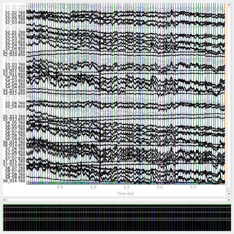
raw_od.plot(n_channels=55, duration=4000, show_scrollbars=False, clipping=None)
<mne_qt_browser._pg_figure.MNEQtBrowser object at 0x7fdb27f0b250>
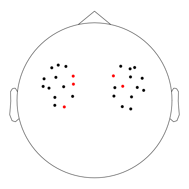
Similarly, we can view the montage diagram and view where on the head the bad channels were positioned.
raw_od.plot_sensors()
<Figure size 640x640 with 1 Axes>
SCI evaluated over initial segment of signal#
The scalp coupling index can be calculated over a limited section of the signal by cropping to the desired section. For example, if you wish to evaluate the data quality of the first 10 seconds of the signal. Note that the difference to evaluation of the entire signal was quite subtle, but this may vary depending on your experimental design and setup.
sci = mne.preprocessing.nirs.scalp_coupling_index(raw_od.copy().crop(10))
fig, ax = plt.subplots()
ax.hist(sci)
ax.set(xlabel="Scalp Coupling Index", ylabel="Count", xlim=[0, 1])
[Text(0.5, 23.52222222222222, 'Scalp Coupling Index'), Text(33.972222222222214, 0.5, 'Count'), (0.0, 1.0)]
SCI evaluated over moving window#
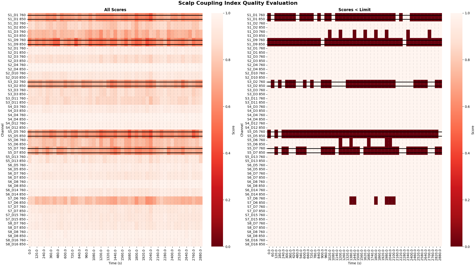
The scalp coupling index can be calculated over windowed chunks of the signal. This plot is based on the meg bad channel detection figures available in mne-bids-pipeline. Black horizontal lines indicate channels that have been marked as bad (see above). The color in the left facet shows the raw scores, The color in the right facet indicates segments that are below the threshold. This is useful for determining if a channel becomes bad throughout an experiment. This may occur due to movement dislodging the optode or many other causes. In this example we set the time window to be 60 seconds, but the user may define a window length that is appropriate for the experiment.
_, scores, times = scalp_coupling_index_windowed(raw_od, time_window=60)
plot_timechannel_quality_metric(
    raw_od,
    scores,
    times,
    threshold=0.7,
    title="Scalp Coupling Index " "Quality Evaluation",
)
<Figure size 2000x1120 with 4 Axes>
Peak Power#
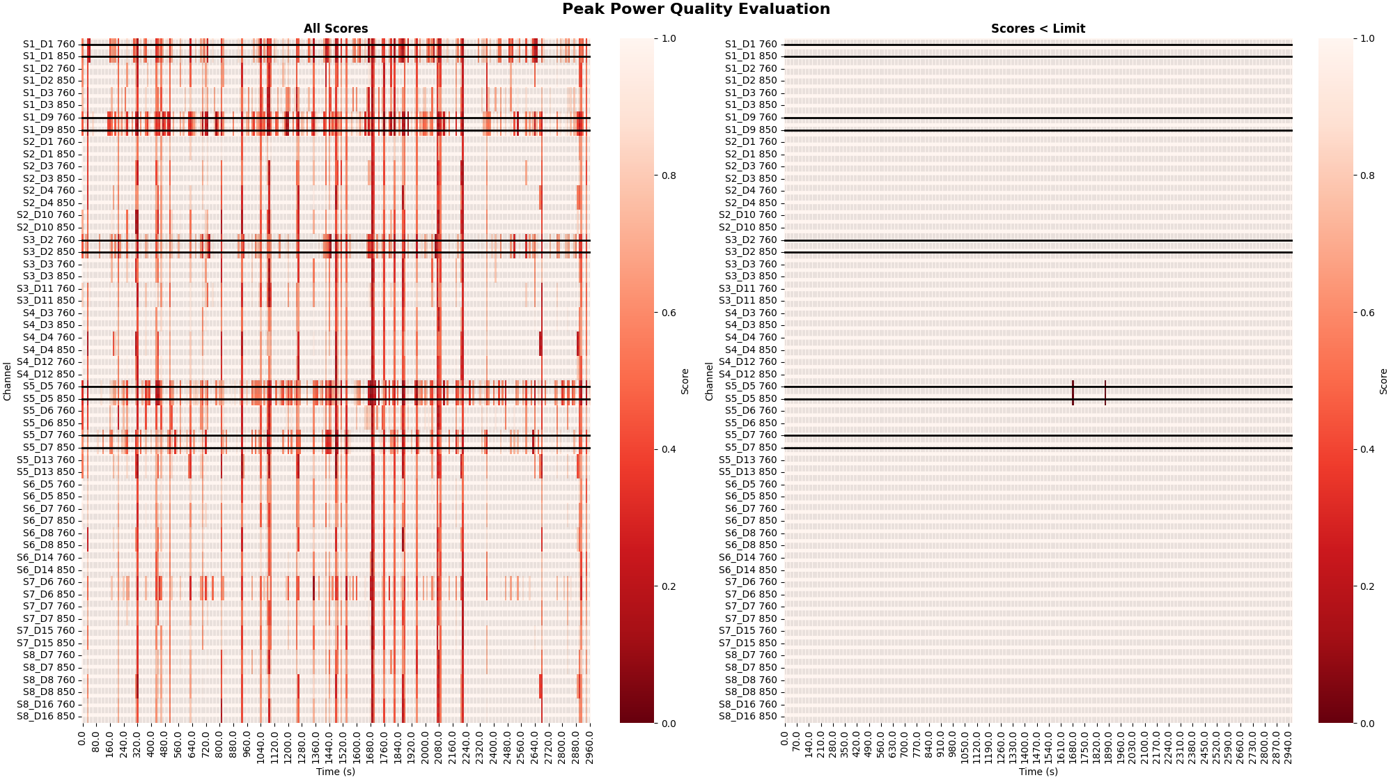
It may also be informative to view the quality of the signal at a finer time resolution. The Peak Power metric provides a quality metric evalauted over a 10 second window. This allows the user to view instances where a subset of channels may be contaminated by artifacts for a short duration of the recording.
raw_od, scores, times = peak_power(raw_od, time_window=10)
plot_timechannel_quality_metric(
    raw_od, scores, times, threshold=0.1, title="Peak Power Quality Evaluation"
)
<Figure size 2000x1120 with 4 Axes>
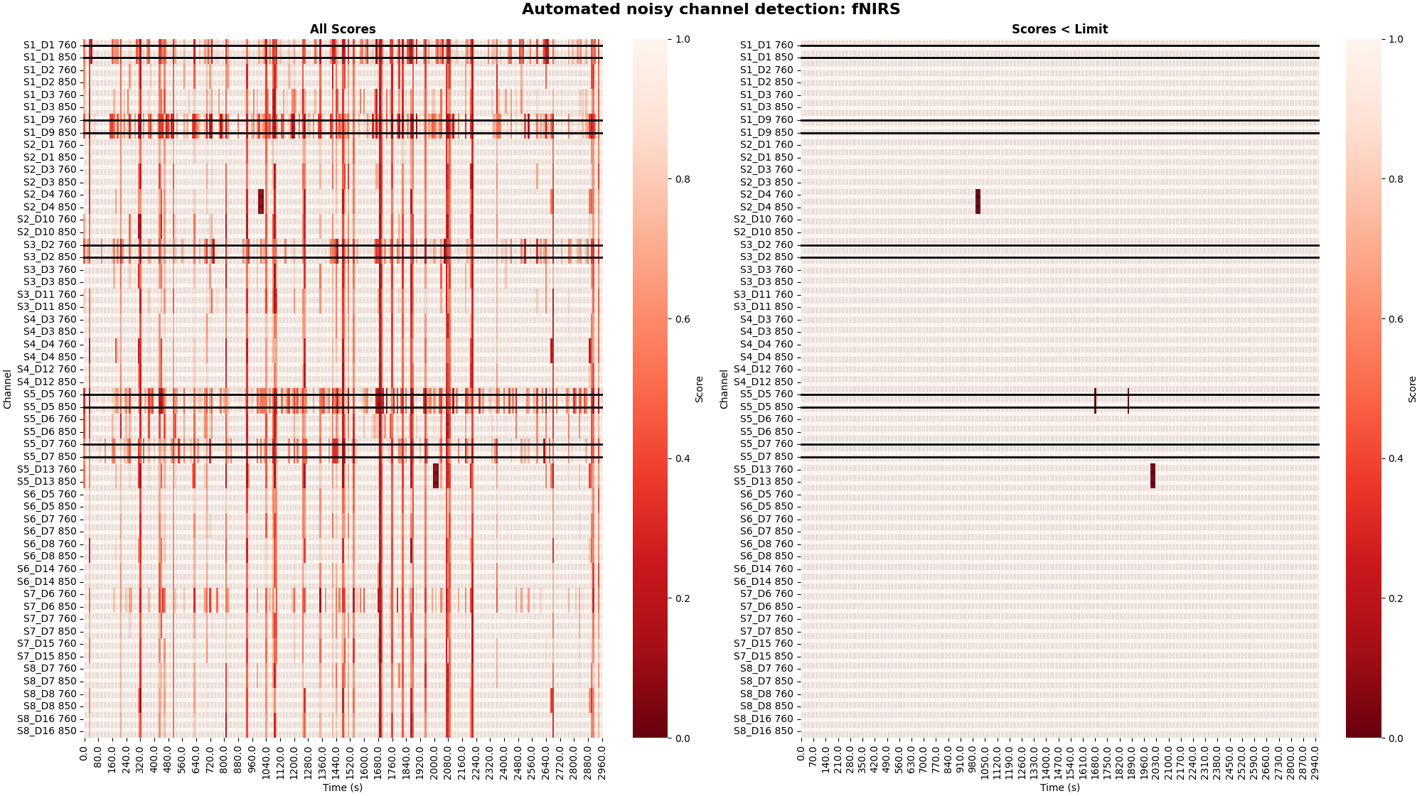
Introduced Noise#
The above data is quite clean, so here we add some noise to channels to demonstrate that the algorithm is able to detect bad segments of data. We add a step like signal at two time instances to mimic an artifact. We add one artifact to channel S2-D4 at 1000 seconds and one artifact to channel S5-D13 at 2000 seconds.
# Add an artifact to channel S2-D4 at time 1000 seconds
raw_od._data[12, 4000:4080] = np.linspace(0, -0.5, 80) + raw_od._data[12, 4000]

# Add an artifact to channel S5-D13 at time 2000 seconds
raw_od._data[34, 8000:8080] = np.linspace(0, 0.5, 80) + raw_od._data[34, 8000]
Next we plot just these channels to demonstrate that indeed an artifact has been added.
raw_od.copy().pick(picks=[12, 13, 34, 35]).plot(
    n_channels=55,
    duration=40000,
    show_scrollbars=False,
    clipping=None,
    scalings={"fnirs_od": 0.2},
)

<mne_qt_browser._pg_figure.MNEQtBrowser object at 0x7fdb27e52200>
Peak Power Metric#
To determine specific time and channel instances where data is of low quality the peak power metric can be utilise (Pollonini, 2016). Below the peak power is calculated and displayed for all channels. The default threshold of 0.1 is applied to the quality scores to determine bad segments of data. The left facet illustrates the raw quality scores. The right facet illustrates the channel and time segments that do not meet the threshold criteria and are marked as bad.
raw_od, scores, times = peak_power(raw_od, time_window=10)
plot_timechannel_quality_metric(raw_od, scores, times, threshold=0.1)
<Figure size 2000x1120 with 4 Axes>
Annotations#
Similar to how entire channels were marked as bad above, the peak power function annotates the raw data structure to indicate where the bad segments of data are. If we replot the subset of channels as above we note that the bad segments are marked in red now, indicating this time section contained bad data. Note that although the red line appears as if the bad marking is present for all channels, this is due to the plotting code. Internally the software knows that only certain channels had a bad segment, and downstream processing will only treat the specified bad channels as bad. I.e. when generating epochs for time 1000 s, no epochs would be generated for channel S2-D4, but channels would be generated for S5-D13 (as the artifact was only present on S2-D4).
raw_od.copy().pick(picks=[12, 13, 34, 35]).plot(
    n_channels=55,
    duration=40000,
    show_scrollbars=False,
    clipping=None,
    scalings={"fnirs_od": 0.2},
)
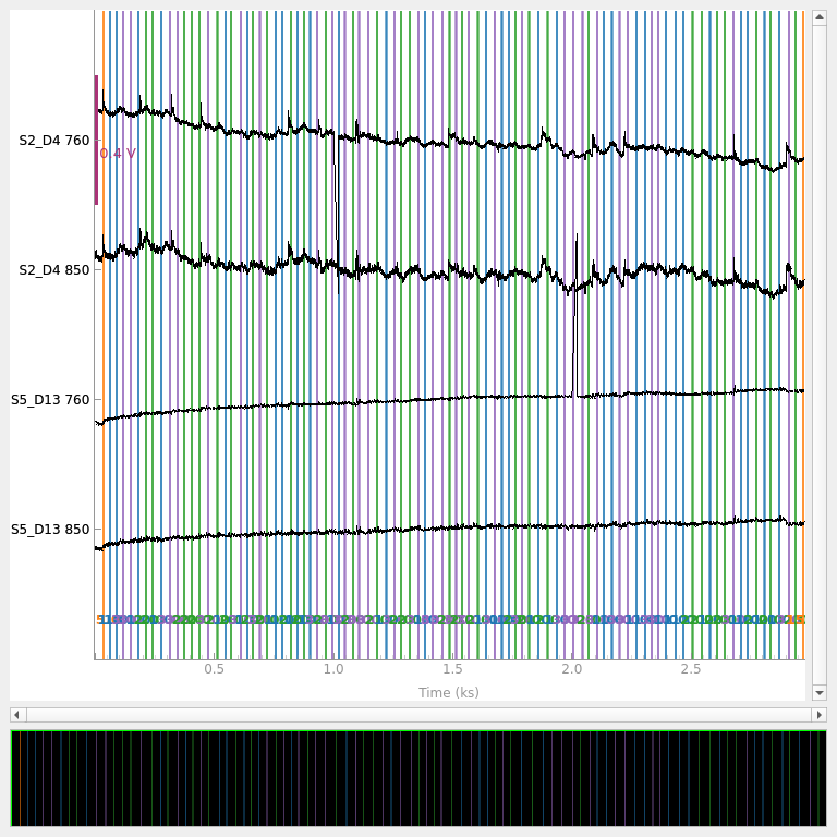
<mne_qt_browser._pg_figure.MNEQtBrowser object at 0x7fdb28d201f0>
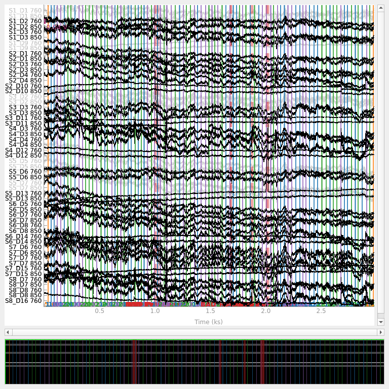
These channel and time specific annotations are used by downstream processing. For example, when extracting epochs if a specific channel has an annotation indicating a bad segment in a specific time window, then the epochs will be discarded for that specific channel. Finally, we display the entire time signal after both channel and time specific quality evaluation. Note that bad channels are now greyed out and bad time segments are marked in red.
raw_od.plot(n_channels=55, duration=4000, show_scrollbars=False, clipping=None)
<mne_qt_browser._pg_figure.MNEQtBrowser object at 0x7fdb27e7b7f0>
Conclusion#
Two data quality metrics were presented and plotted. One metric for determining a bad channel (scalp coupling index). And one metric for determining specific time and channel segments that are bad. It was demonstrated how bad segments are visualised and how bad segments are treated in downstream analysis.
Total running time of the script: (0 minutes 25.520 seconds)
Estimated memory usage: 432 MB