mne_nirs.visualisation.plot_timechannel_quality_metric#

mne_nirs.visualisation.plot_timechannel_quality_metric(raw, scores, times, threshold=0.1, title=None)[source]#

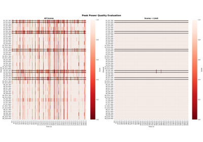
Plot time x channel based quality metrics.

The left figure shows the raw score per channel and time.

Parameters:
rawinstance of Raw

The haemoglobin data.

scoresarray

The quality metric scores.

timeslist of pairs

Start and end time for each quality metric.

thresholdfloat

Value below which a segment will be marked as bad.

titlestr

Title of plot. If not specified a default title will be used.

Returns:
figfigure

Matplotlib figure displaying raw scores and thresholded scores.

Examples using mne_nirs.visualisation.plot_timechannel_quality_metric#

Signal Quality Evaluation

Signal Quality Evaluation