Note
Go to the end to download the full example code. or to run this example in your browser via Binder
Frequency and Filter Commentary#
In this example we discuss frequency and filters in the context of functional near-infrared spectroscopy (fNIRS) analysis. We examine the interplay between the expected brain response based on experimental design and our model of how the brain reacts to stimuli, the actual data measured during an experiment, and the filtering that is applied to the data.
# Authors: Robert Luke <mail@robertluke.net>
#
# License: BSD (3-clause)

import os

import matplotlib.pyplot as plt
import mne
import numpy as np

import mne_nirs
from mne_nirs.experimental_design import make_first_level_design_matrix
from mne_nirs.simulation import simulate_nirs_raw
Import and preprocess data#
We read in the data, annotate the triggers, remove the control condition, convert to haemoglobin concentration.
This code is similar to the first sections in the MNE tutorial, so will not be described in detail here. Please see the MNE documentation. for a detailed introduction to processing NIRS with MNE.
fnirs_data_folder = mne.datasets.fnirs_motor.data_path()
fnirs_raw_dir = os.path.join(fnirs_data_folder, "Participant-1")
raw_intensity = mne.io.read_raw_nirx(fnirs_raw_dir, verbose=True).load_data()
new_des = [des for des in raw_intensity.annotations.description]
new_des = ["Control" if x == "1.0" else x for x in new_des]
new_des = ["Tapping_Left" if x == "2.0" else x for x in new_des]
new_des = ["Tapping_Right" if x == "3.0" else x for x in new_des]
annot = mne.Annotations(
    raw_intensity.annotations.onset, raw_intensity.annotations.duration * 5.0, new_des
)
raw_intensity.set_annotations(annot)
raw_intensity.crop(60, 2967)
raw_intensity.annotations.delete(
    np.where([d == "Control" for d in raw_intensity.annotations.description])
)

raw_od = mne.preprocessing.nirs.optical_density(raw_intensity)
raw_haemo = mne.preprocessing.nirs.beer_lambert_law(raw_od, ppf=0.1)
raw_haemo = mne_nirs.channels.get_long_channels(raw_haemo)
Loading /home/circleci/mne_data/MNE-fNIRS-motor-data/Participant-1
Model neural response#
We know the when each stimulus was presented to the lister (see Annotations) and we have a model of how we expect the brain to react to each stimulus presentation (https://en.wikipedia.org/wiki/Haemodynamic_response). From this information we can build a model of how we expect the brain to be active during this experiment. See GLM Analysis (Measured) for more details on this analysis.
Here we create the expected model neural response function using the data and plot the frequency spectrum.
We note there is a peak at 0.03 which corresponds approximately to the repetition rate of the experiment.
design_matrix = make_first_level_design_matrix(raw_haemo, drift_order=0, stim_dur=5.0)

# This is a bit of a hack.
# Overwrite the first NIRS channel with the expected response.
# Rescale to be in expected units of uM.
hrf = raw_haemo.copy().pick(picks=[0])
hrf._data[0] = 1e-6 * (design_matrix["Tapping_Left"] + design_matrix["Tapping_Right"]).T
hrf.pick(picks="hbo").compute_psd(fmax=2).plot(
    average=True, xscale="log", color="r", show=False, amplitude=False
)
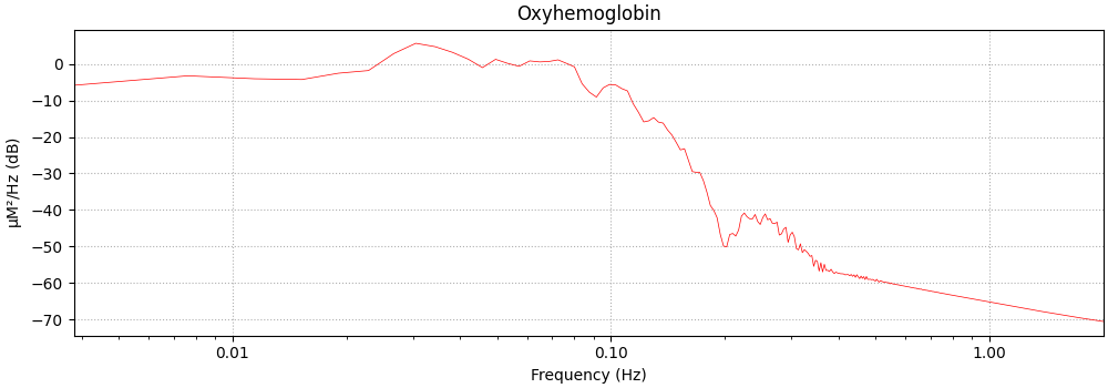
<MNELineFigure size 1000x350 with 1 Axes>
Plot raw measured data#
Next we plot the PSD of the raw data.
Note the increased activity around 1 Hz, this is the heart rate. We also see an increase in activity around 0.1 Hz, this is likely Mayer waves (https://en.wikipedia.org/wiki/Mayer_waves). There is also a small bump around 0.3 Hz that is likely the breathing rate.
# TODO: I would like to find a nicer way to fit everything in one plot.
# Could I use a left y axis for the real data?
#
# TODO: Find a way not to have to rescale the data to fit in plot

# rescale data to fit in plot. TODO: fix this
raw_haemo._data = raw_haemo._data * 1e-2
raw_haemo.pick(picks="hbo").compute_psd(fmax=2).plot(
    average=True, xscale="log", amplitude=False
)
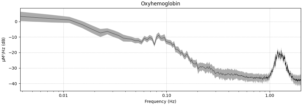
<MNELineFigure size 1000x350 with 1 Axes>
Plot epoched data#
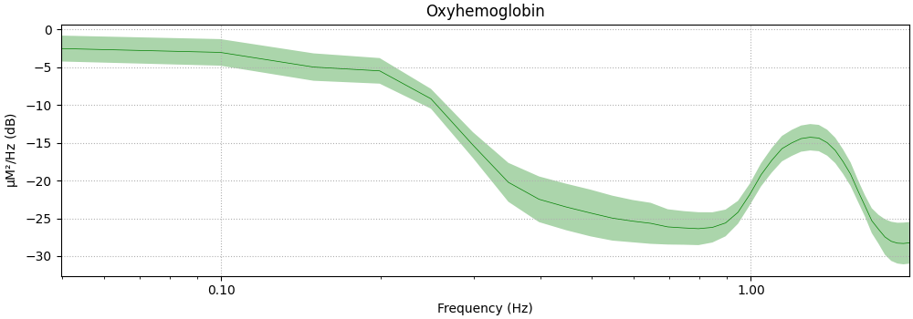
Next we plot the PSD of the epoched data.
The act of averaging the epochs removes some of the systemic components that are not time locked to the stimulus. However, the large heart rate component is still visible.
events, _ = mne.events_from_annotations(raw_haemo)
event_dict = {"Tapping_Left": 1, "Tapping_Right": 2}
reject_criteria = dict(hbo=120e-6)
tmin, tmax = -5, 15
epochs = mne.Epochs(
    raw_haemo,
    events,
    event_id=event_dict,
    tmin=tmin,
    tmax=tmax,
    reject=reject_criteria,
    reject_by_annotation=True,
    proj=True,
    baseline=(None, 0),
    preload=True,
    detrend=None,
    verbose=True,
)

epochs.pick(picks="hbo").compute_psd(fmax=2).plot(
    average=True, color="g", xscale="log", amplitude=False
)
Not setting metadata
60 matching events found
Setting baseline interval to [-4.992, 0.0] s
Applying baseline correction (mode: mean)
0 projection items activated
Using data from preloaded Raw for 60 events and 157 original time points ...
0 bad epochs dropped

<MNELineFigure size 1000x350 with 1 Axes>
Plot filter response#
Next we plot the filter response. For an introduction to filtering see https://mne.tools/stable/auto_tutorials/discussions/plot_background_filtering.html
This filter will be designed to remove the heart rate component that remained after epoching.
filter_params = mne.filter.create_filter(
    raw_haemo.get_data(),
    raw_haemo.info["sfreq"],
    l_freq=None,
    h_freq=0.4,
    h_trans_bandwidth=0.2,
)

mne.viz.plot_filter(
    filter_params,
    raw_haemo.info["sfreq"],
    flim=(0.005, 2),
    fscale="log",
    gain=False,
    plot="magnitude",
)
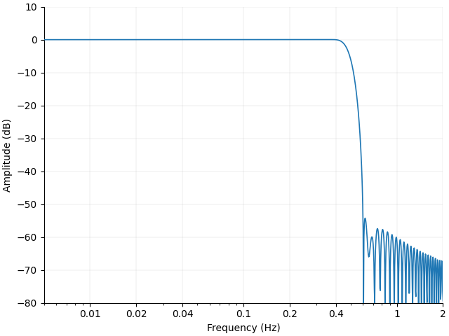
<Figure size 640x480 with 1 Axes>
Discussion#
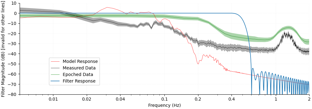
Finally we overlay all lines on the same figure to see how the different components relate.
First, note that the filter cutoff above 0.4 Hz attenuates the unwanted heart rate component which is situated around 1 Hz.
Next we observe in the measured data that the Mayer waves situated around 0.1 Hz are in the same range as the expected peak in the model response. For this reason the filter does not attenuate these frequencies. However, as the experiment was designed with a randomised inter stimulus interval the act of epoching and averaging the data removes these unwanted components and they are not visible in the epoched data.
fig = (
    hrf.pick(picks="hbo")
    .compute_psd(fmax=2)
    .plot(average=True, color="r", show=False, amplitude=False)
)
raw_haemo.pick(picks="hbo").compute_psd(fmax=2).plot(
    average=True, axes=fig.axes, show=False, amplitude=False
)
epochs.pick(picks="hbo").compute_psd(fmax=2).plot(
    average=True, axes=fig.axes, show=False, color="g", amplitude=False
)
mne.viz.plot_filter(
    filter_params,
    raw_haemo.info["sfreq"],
    flim=(0.005, 2),
    fscale="log",
    gain=False,
    plot="magnitude",
    axes=fig.axes,
    show=False,
)

leg_lines = [line for line in fig.axes[0].lines if line.get_linestyle() == "-"]
fig.legend(
    leg_lines,
    ["Model Response", "Measured Data", "Epoched Data", "Filter Response"],
    loc="lower left",
    bbox_to_anchor=(0.15, 0.2),
)
fig.axes[0].set_ylabel("Filter Magnitude (dB) [invalid for other lines]")
fig.axes[0].set_title("")
Text(0.5, 1.0, '')
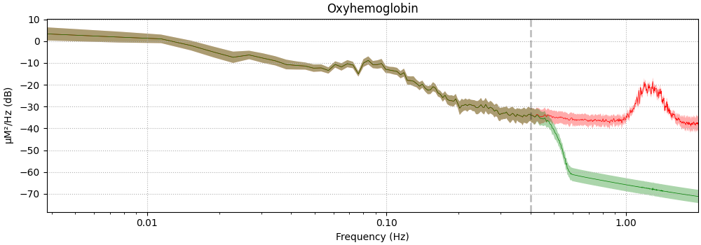
Filter Neural Signal#
The effect of filtering on the neural signal is demonstrated below. The green line illustrates the signal before filtering, and the red line shows the signal after filtering.
<MNELineFigure size 1000x350 with 1 Axes>
Understanding the relation between stimulus presentation and response#
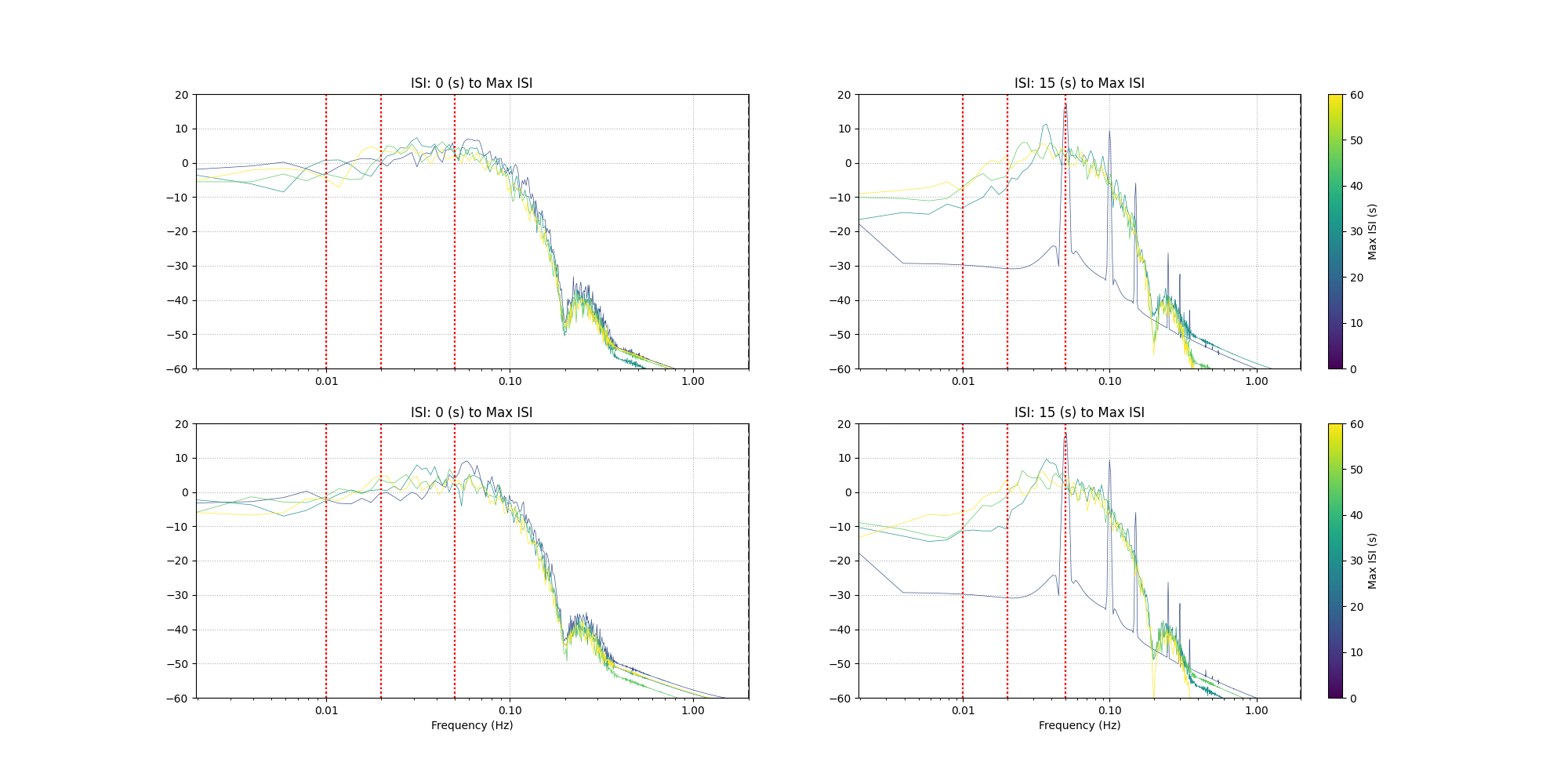
Here we look at the effect of the interstimulus interval on the expected haemodynamic response. We choose a few different maximum and minimum values for the ISI. Two repeats are plotted per ISI to illustrate the random selection. Some common high pass filter values from literature are shown in red.
sm = plt.cm.ScalarMappable(cmap="viridis", norm=plt.Normalize(vmin=0, vmax=60))
fig, axes = plt.subplots(nrows=2, ncols=2, figsize=(20, 10))
for rep in range(2):
    for column, min_isi in enumerate([0, 15]):
        for row, max_isi in enumerate([15, 30, 45, 60]):
            if max_isi >= min_isi:
                raw = simulate_nirs_raw(
                    sfreq=4.0,
                    sig_dur=60 * 60,
                    amplitude=1.0,
                    stim_dur=5.0,
                    isi_min=min_isi,
                    isi_max=max_isi,
                )
                raw._data[0] = raw._data[0] - np.mean(raw._data[0])
                raw.pick(picks="hbo").compute_psd(fmax=2).plot(
                    average=True,
                    axes=axes[rep, column],
                    show=False,
                    color=sm.cmap(sm.norm(max_isi)),
                    xscale="log",
                    amplitude=False,
                )
                axes[rep, column].set_ylim(-60, 20)
                axes[rep, column].set_title(f"ISI: {min_isi} (s) to Max ISI")
                for filt in [0.01, 0.02, 0.05]:
                    axes[rep, column].axvline(x=filt, linestyle=":", color="red")
        axes[1, column].set_xlabel("Frequency (Hz)")
    plt.colorbar(sm, ax=axes[rep, 1], label="Max ISI (s)")
Total running time of the script: (0 minutes 26.154 seconds)
Estimated memory usage: 431 MB