mne.viz.plot_ideal_filter#
- mne.viz.plot_ideal_filter(freq, gain, axes=None, title='', flim=None, fscale='log', alim=(-80, 10), color='r', alpha=0.5, linestyle='--', show=True)[source]#
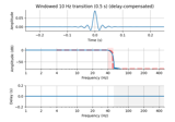
Plot an ideal filter response.
- Parameters:
- freqarray-like
The ideal response frequencies to plot (must be in ascending order).
- gainarray-like or
None The ideal response gains to plot.
- axesinstance of
Axes|None The subplot handle. With None (default), axes are created.
- title
str The title to use, (default: ‘’).
- flim
tupleorNone If not None, the x-axis frequency limits (Hz) to use. If None (default), freq used.
- fscale
str Frequency scaling to use, can be “log” (default) or “linear”.
- alim
tuple If not None (default), the y-axis limits (dB) to use.
- colorcolor object
The color to use (default: ‘r’).
- alpha
float The alpha to use (default: 0.5).
- linestyle
str The line style to use (default: ‘–‘).
- showbool
Show figure if True (default).
- Returns:
- figinstance of
matplotlib.figure.Figure The figure.
- figinstance of
See also
Notes
New in version 0.14.
Examples
Plot a simple ideal band-pass filter:
>>> from mne.viz import plot_ideal_filter
>>> freq = [0, 1, 40, 50]
>>> gain = [0, 1, 1, 0]
>>> plot_ideal_filter(freq, gain, flim=(0.1, 100))
<...Figure...>
