Note
Go to the end to download the full example code.
Built-in plotting methods for Raw objects#
This tutorial shows how to plot continuous data as a time series, how to plot the
spectral density of continuous data, and how to plot the sensor locations and projectors
stored in Raw objects.
As usual we’ll start by importing the modules we need, loading some
example data, and cropping the Raw object to just 60
seconds before loading it into RAM to save memory:
# Authors: The MNE-Python contributors.
# License: BSD-3-Clause
# Copyright the MNE-Python contributors.
import os

import mne

sample_data_folder = mne.datasets.sample.data_path()
sample_data_raw_file = os.path.join(
    sample_data_folder, "MEG", "sample", "sample_audvis_raw.fif"
)
raw = mne.io.read_raw_fif(sample_data_raw_file)
raw.crop(tmax=60).load_data()
Opening raw data file /home/circleci/mne_data/MNE-sample-data/MEG/sample/sample_audvis_raw.fif...
    Read a total of 3 projection items:
        PCA-v1 (1 x 10²)  idle
        PCA-v2 (1 x 10²)  idle
        PCA-v3 (1 x 10²)  idle
    Range : 25800 ... 192599 =     42.956 ...   320.670 secs
Ready.
Reading 0 ... 36037  =      0.000 ...    60.000 secs...
We’ve seen in a previous tutorial how to plot data
from a Raw object using matplotlib,
but Raw objects also have several built-in plotting methods:
The first one is discussed here in detail; the last two are shown briefly
and covered in-depth in other tutorials. This tutorial also covers a few
ways of plotting the spectral content of Raw data.
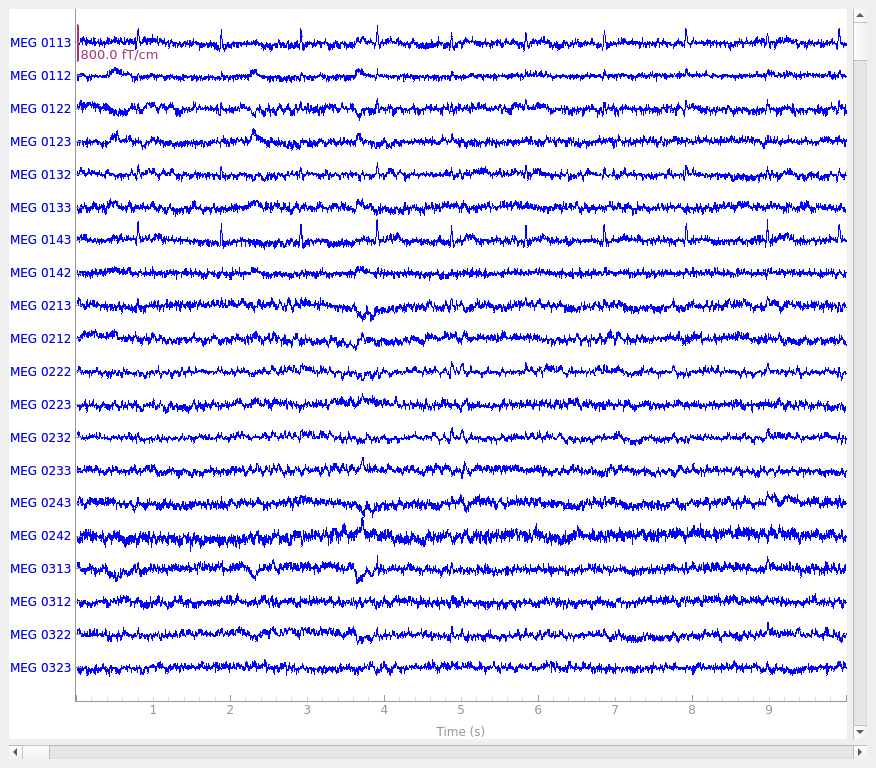
Interactive data browsing with Raw.plot()#
The plot method of Raw objects provides
a versatile interface for exploring continuous data. For interactive viewing
and data quality checking, it can be called with no additional parameters:
raw.plot()
Using qt as 2D backend.
It may not be obvious when viewing this tutorial online, but by default, the
plot method generates an interactive plot window with
several useful features:
It spaces the channels equally along the y-axis.
20 channels are shown by default; you can scroll through the channels using the ↑ and ↓ arrow keys, or by clicking on the colored scroll bar on the right edge of the plot.
The number of visible channels can be adjusted by the
n_channelsparameter, or changed interactively using page up and page down keys.You can toggle the display to “butterfly” mode (superimposing all channels of the same type on top of one another) by pressing b, or start in butterfly mode by passing the
butterfly=Trueparameter.
It shows the first 10 seconds of the
Rawobject.You can shorten or lengthen the window length using home and end keys, or start with a specific window duration by passing the
durationparameter.You can scroll in the time domain using the ← and → arrow keys, or start at a specific point by passing the
startparameter. Scrolling using shift→ or shift← scrolls a full window width at a time.
It allows clicking on channels to mark/unmark as “bad”.
It allows interactive annotation of the raw data.
This allows you to mark time spans that should be excluded from future computations due to large movement artifacts, line noise, or other distortions of the signal. Annotation mode is entered by pressing a. See Basic annotation for details.
It automatically applies any projectors before plotting the data.
These can be enabled/disabled interactively by clicking the
Projbutton at the lower right corner of the plot window, or disabled by default by passing theproj=Falseparameter. See Background on projectors and projections for more info on projectors.
These and other keyboard shortcuts are listed in the Help window, accessed
through the Help button at the lower left corner of the plot window.
Other plot properties (such as color of the channel traces, channel order and
grouping, simultaneous plotting of events, scaling, clipping,
filtering, etc.) can also be adjusted through parameters passed to the
plot method; see the docstring for details.
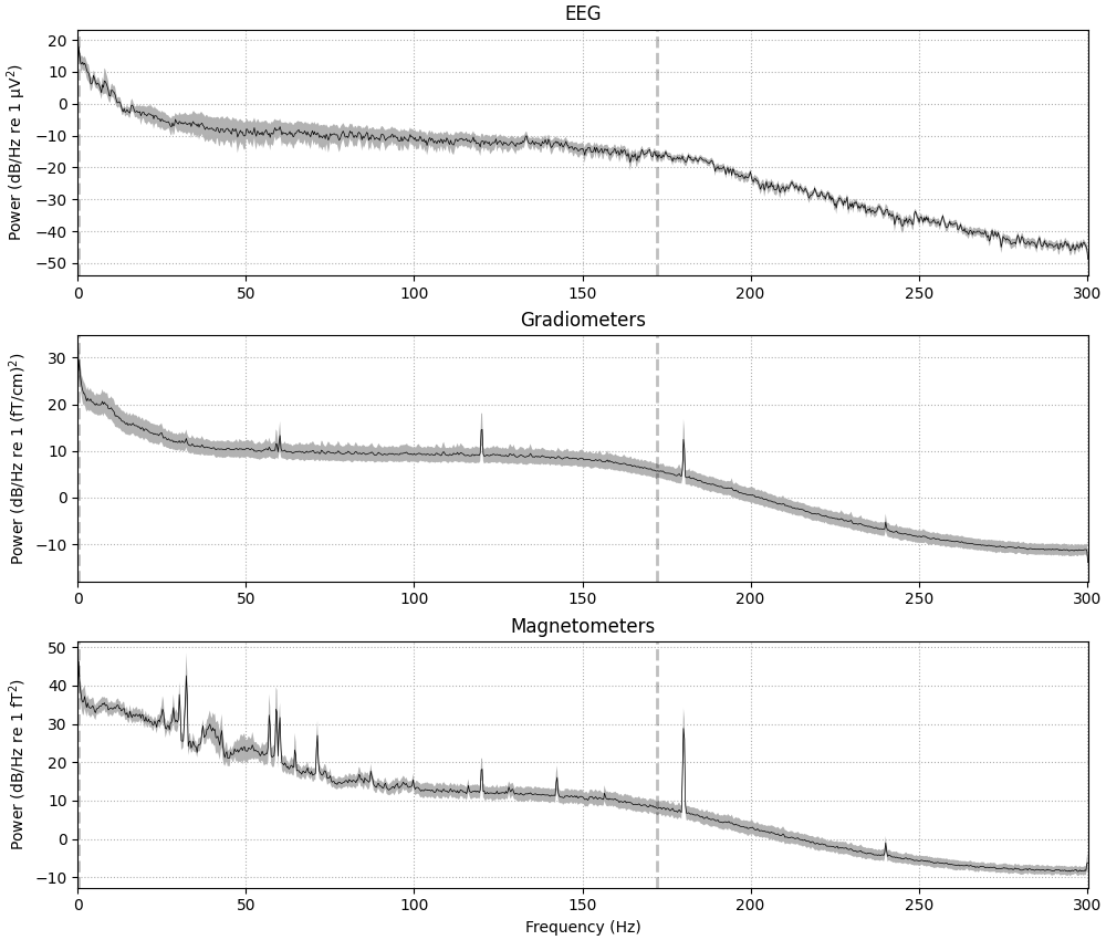
Plotting spectral density of continuous data#
To visualize the frequency content of continuous data, the Raw
object provides a compute_psd() method to compute
spectral density and the resulting Spectrum
object has a plot() method:
spectrum = raw.compute_psd()
spectrum.plot(average=True, picks="data", exclude="bads", amplitude=False)
Effective window size : 3.410 (s)
Plotting power spectral density (dB=True).
If the data have been filtered, vertical dashed lines will automatically
indicate filter boundaries. The spectrum for each channel type is drawn in
its own subplot; here we’ve passed the average=True parameter to get a
summary for each channel type, but it is also possible to plot each channel
individually, with options for how the spectrum should be computed,
color-coding the channels by location, and more. For example, here is a plot
of just a few sensors (specified with the picks parameter), color-coded
by spatial location (via the spatial_colors parameter, see the
documentation of plot for full details):
midline = ["EEG 002", "EEG 012", "EEG 030", "EEG 048", "EEG 058", "EEG 060"]
spectrum.plot(picks=midline, exclude="bads", amplitude=False)
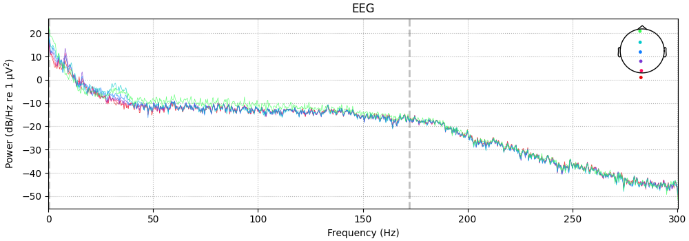
Plotting power spectral density (dB=True).
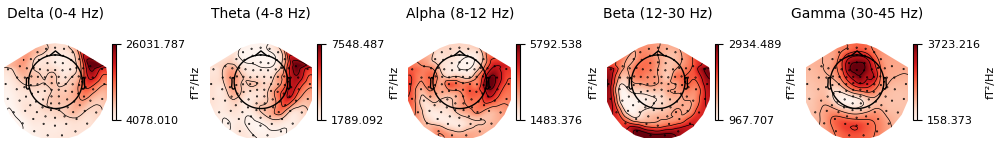
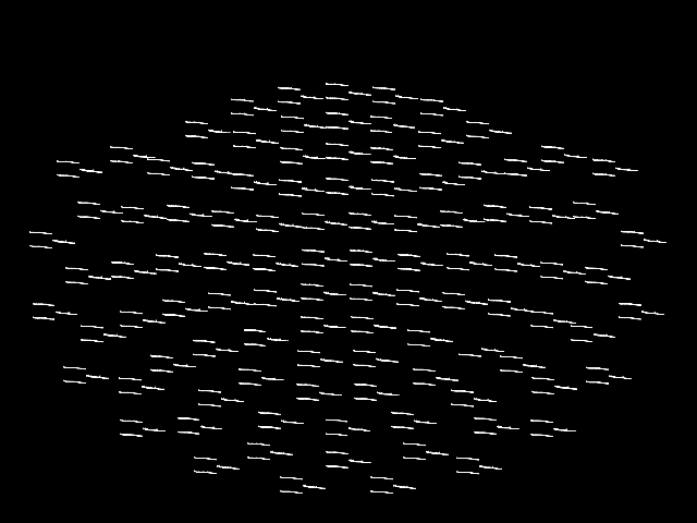
It is also possible to plot spectral power estimates across sensors as a
scalp topography, using the Spectrum’s
plot_topomap() method. The default
parameters will plot five frequency bands (δ, θ, α, β, γ), will compute power
based on magnetometer channels (if present), and will plot the power
estimates on a dB-like log-scale:
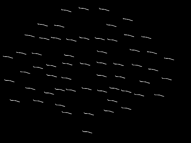
Alternatively, you can plot the PSD for every sensor on its own axes, with
the axes arranged spatially to correspond to sensor locations in space, using
plot_topo:
This plot is also interactive; hovering over each “thumbnail” plot will
display the channel name in the bottom left of the plot window, and clicking
on a thumbnail plot will create a second figure showing a larger version of
the selected channel’s spectral density (as if you had called
plot with that channel passed as picks).
By default, plot_topo will show only the MEG
channels if MEG channels are present; if only EEG channels are found, they
will be plotted instead:
spectrum.pick("eeg").plot_topo()
Note
Prior to the addition of the Spectrum class,
the above plots were possible via:
(there was no plot_topomap method for Raw). The
plot_psd() and plot_psd_topo() methods
of Raw objects are still provided to support legacy
analysis scripts, but new code should instead use the
Spectrum object API.
Plotting sensor locations from Raw objects#
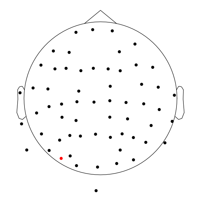
The channel locations in a Raw object can be easily plotted
with the plot_sensors method. A brief example is shown
here; notice that channels in raw.info['bads'] are plotted in red. More
details and additional examples are given in the tutorial
Working with sensor locations.
raw.plot_sensors(ch_type="eeg")
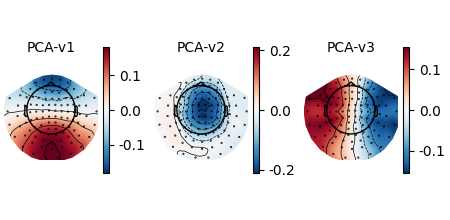
Plotting projectors from Raw objects#
As seen in the output of mne.io.read_raw_fif above, there are
projectors included in the example Raw
file (representing environmental noise in the signal, so it can later be
“projected out” during preprocessing). You can visualize these projectors
using the plot_projs_topomap method. By default it will
show one figure per channel type for which projectors are present, and each
figure will have one subplot per projector. The three projectors in this file
were only computed for magnetometers, so one figure with three subplots is
generated. More details on working with and plotting projectors are given in
Background on projectors and projections and Repairing artifacts with SSP.
raw.plot_projs_topomap(colorbar=True)
Total running time of the script: (0 minutes 4.485 seconds)